The Anatomy of a Great Cannabis Print Menu with BudSense

If you've ever walked into a dispensary, you know that the experience starts with the menu. It's like the gateway to your cannabis adventure, guiding you through a world of strains, pre-rolls, and edibles. But what separates a good menu from a great one? Well, that's where BudSense comes in, helping dispensaries craft menus that inform and delight their customers. Let's dive into the key ingredients that make up the anatomy of a fantastic cannabis print menu with BudSense!
8 Key points to consider:
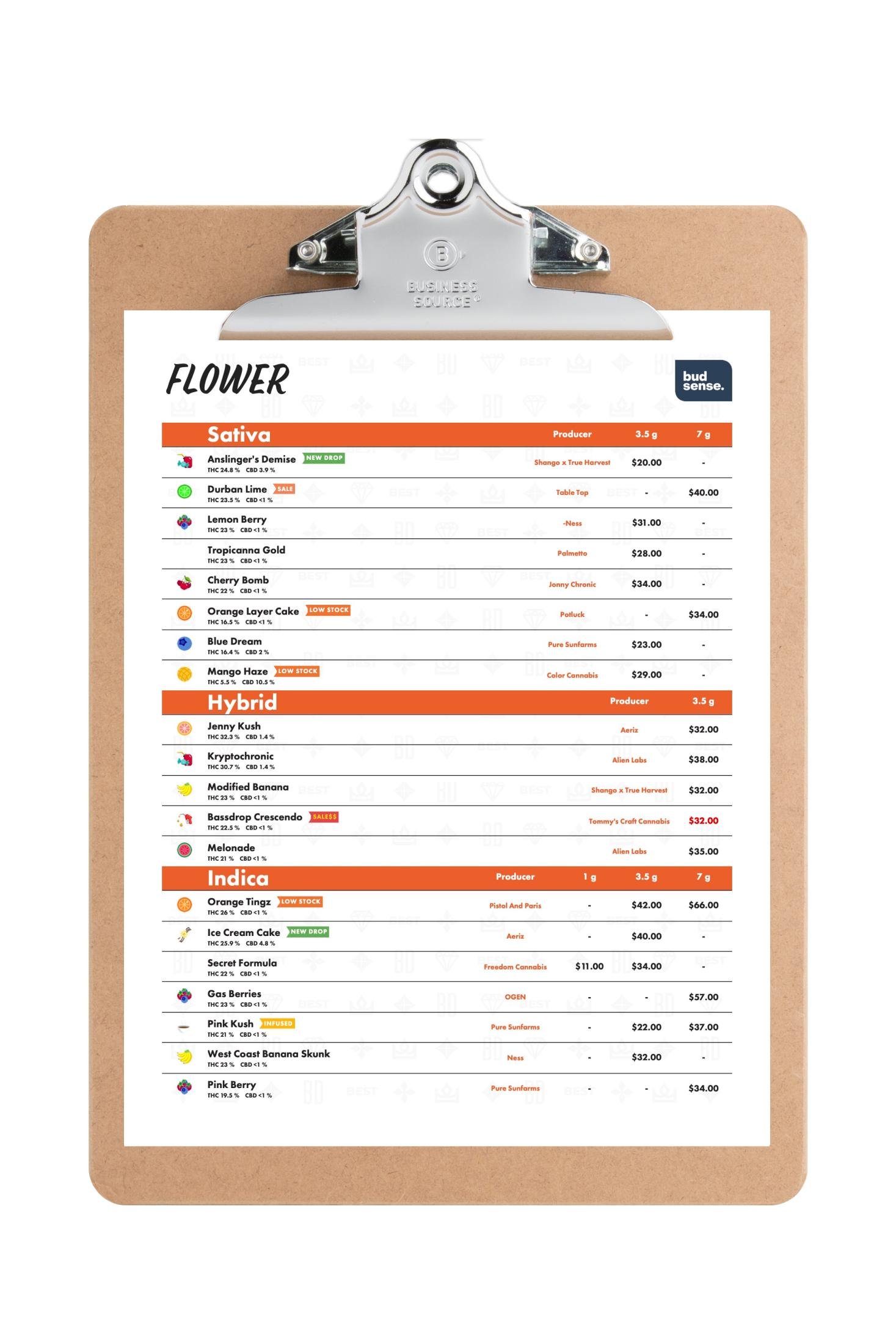
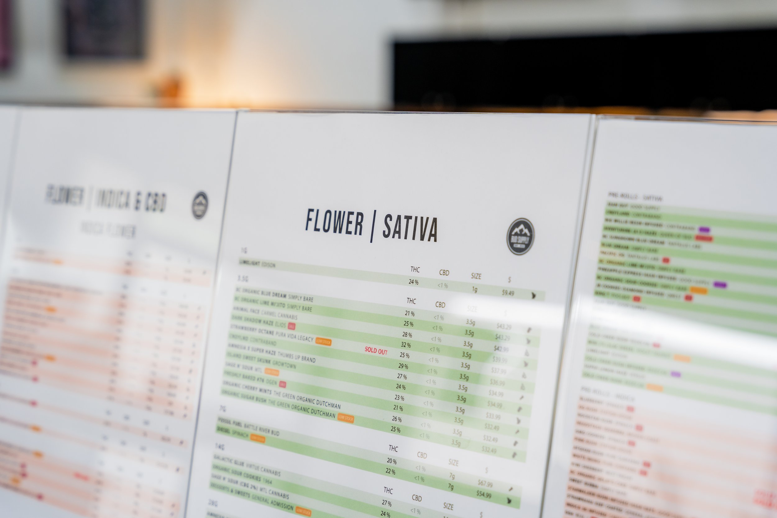
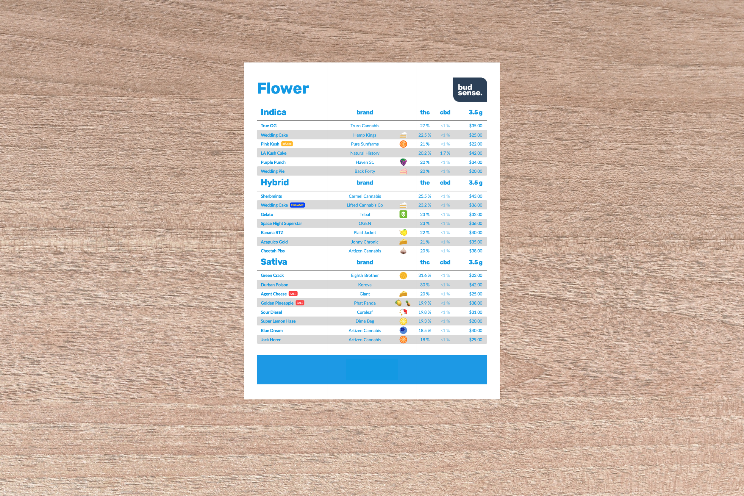
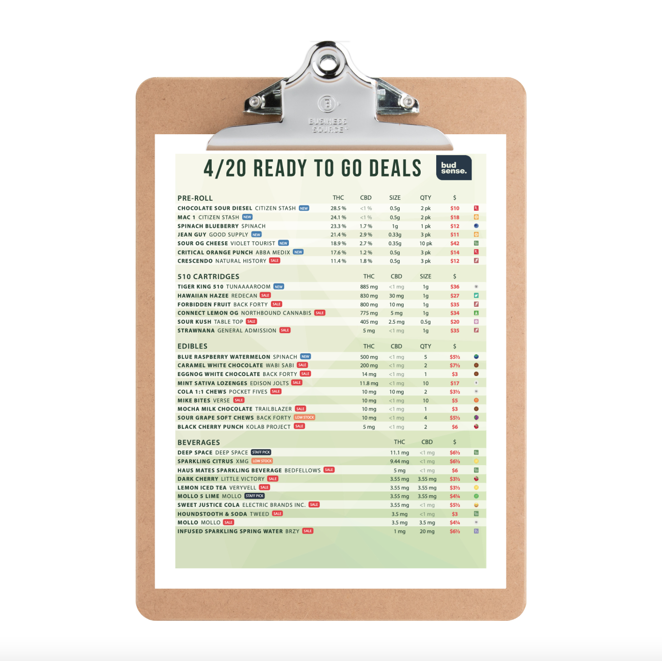
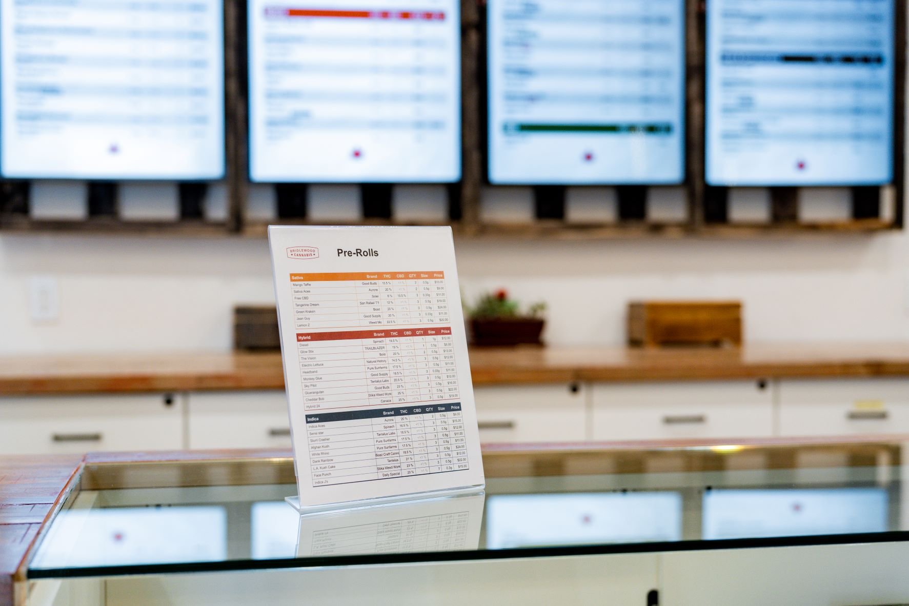
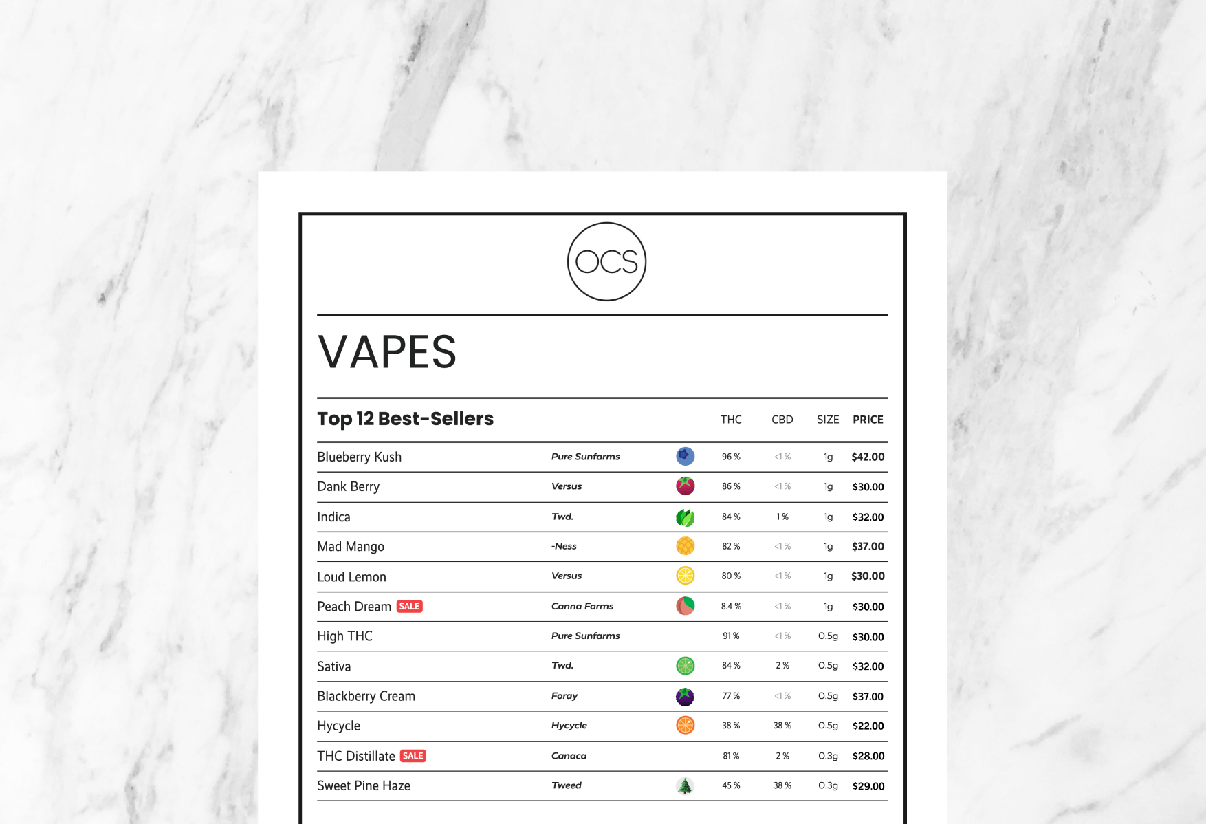
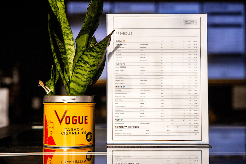
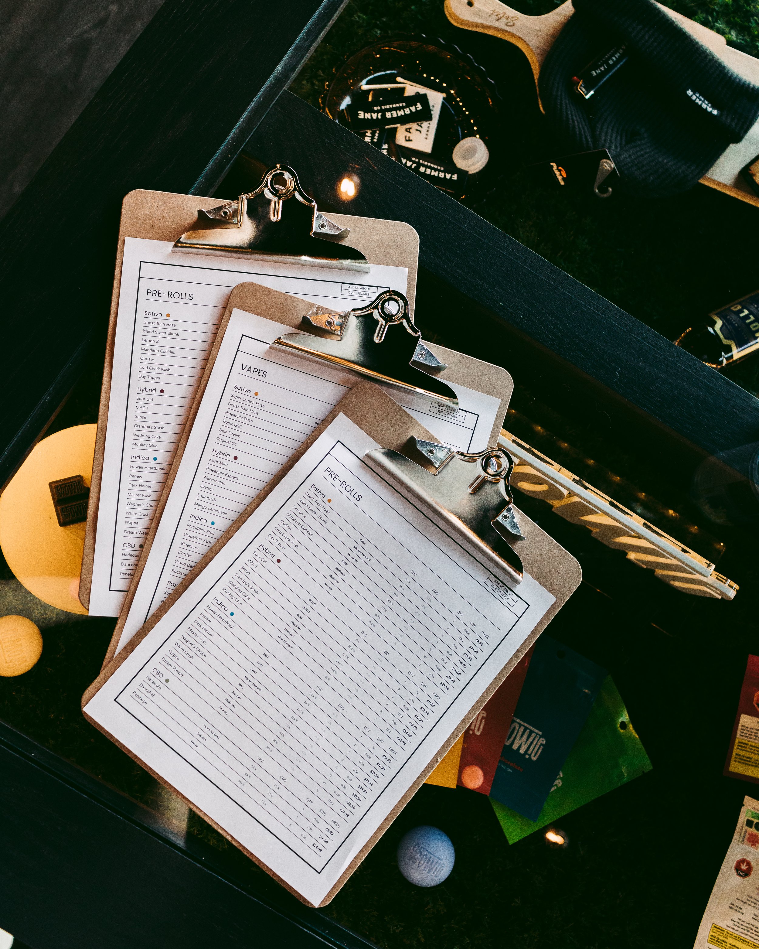
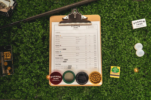
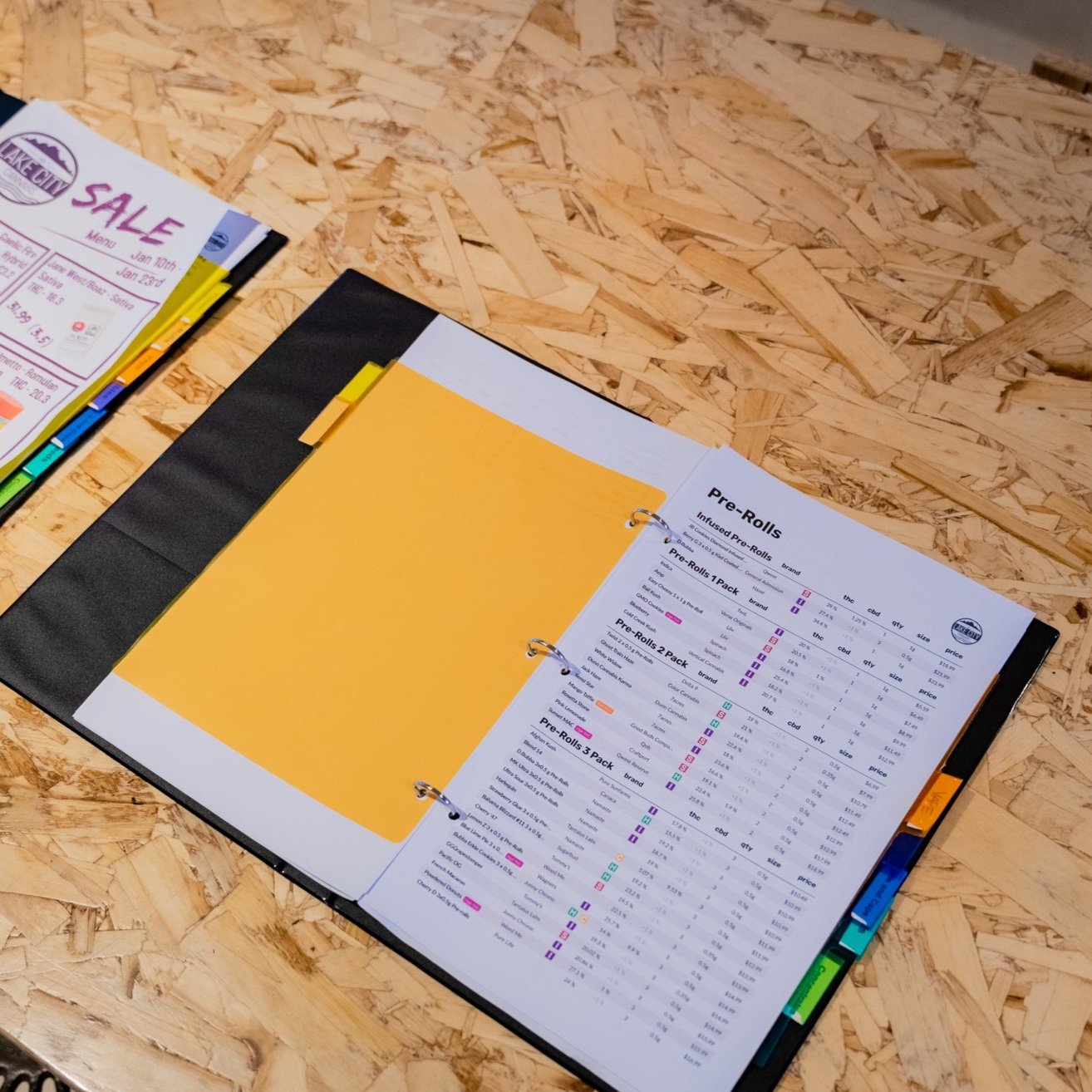
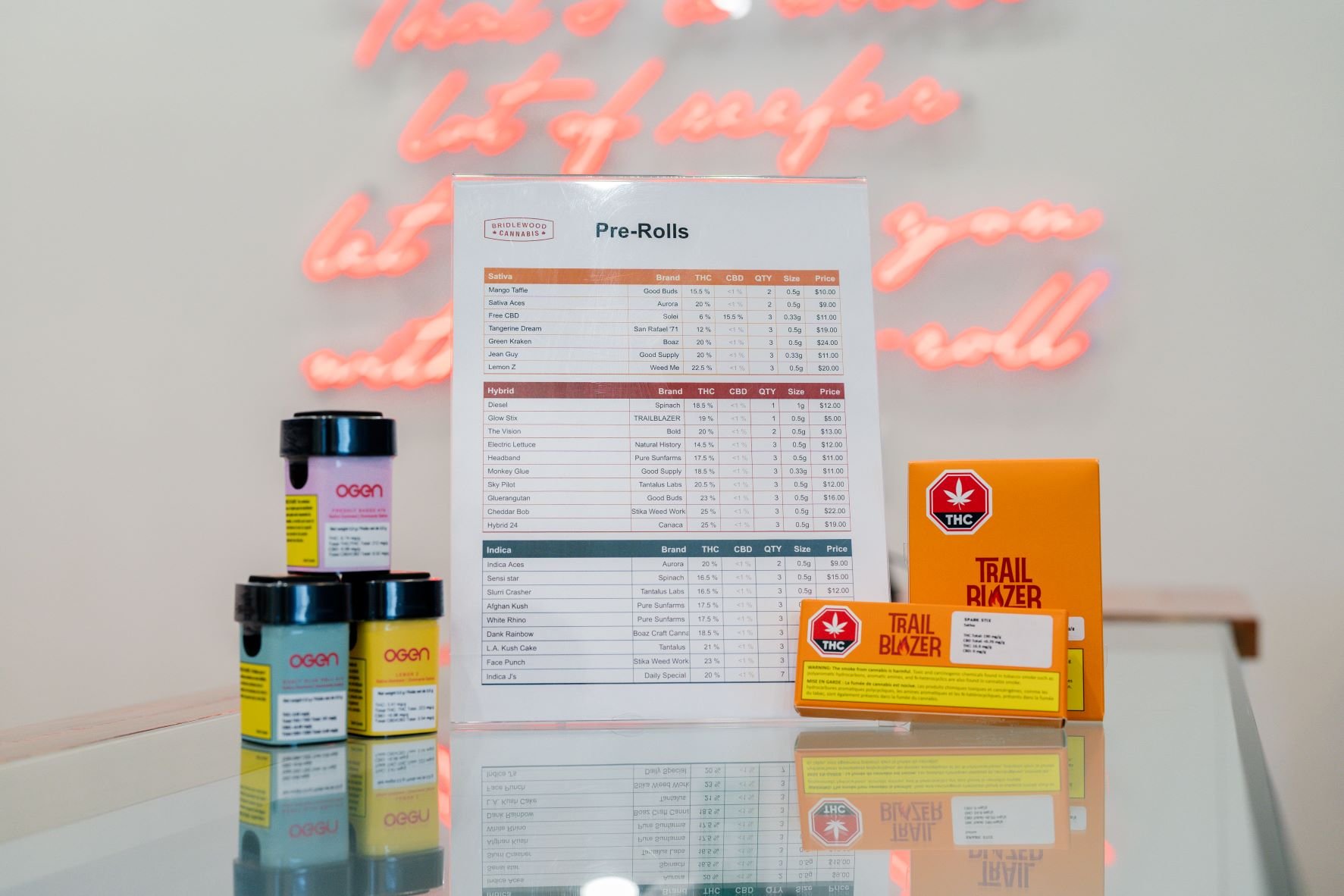
1) Large Section Titles: Navigational Beacons
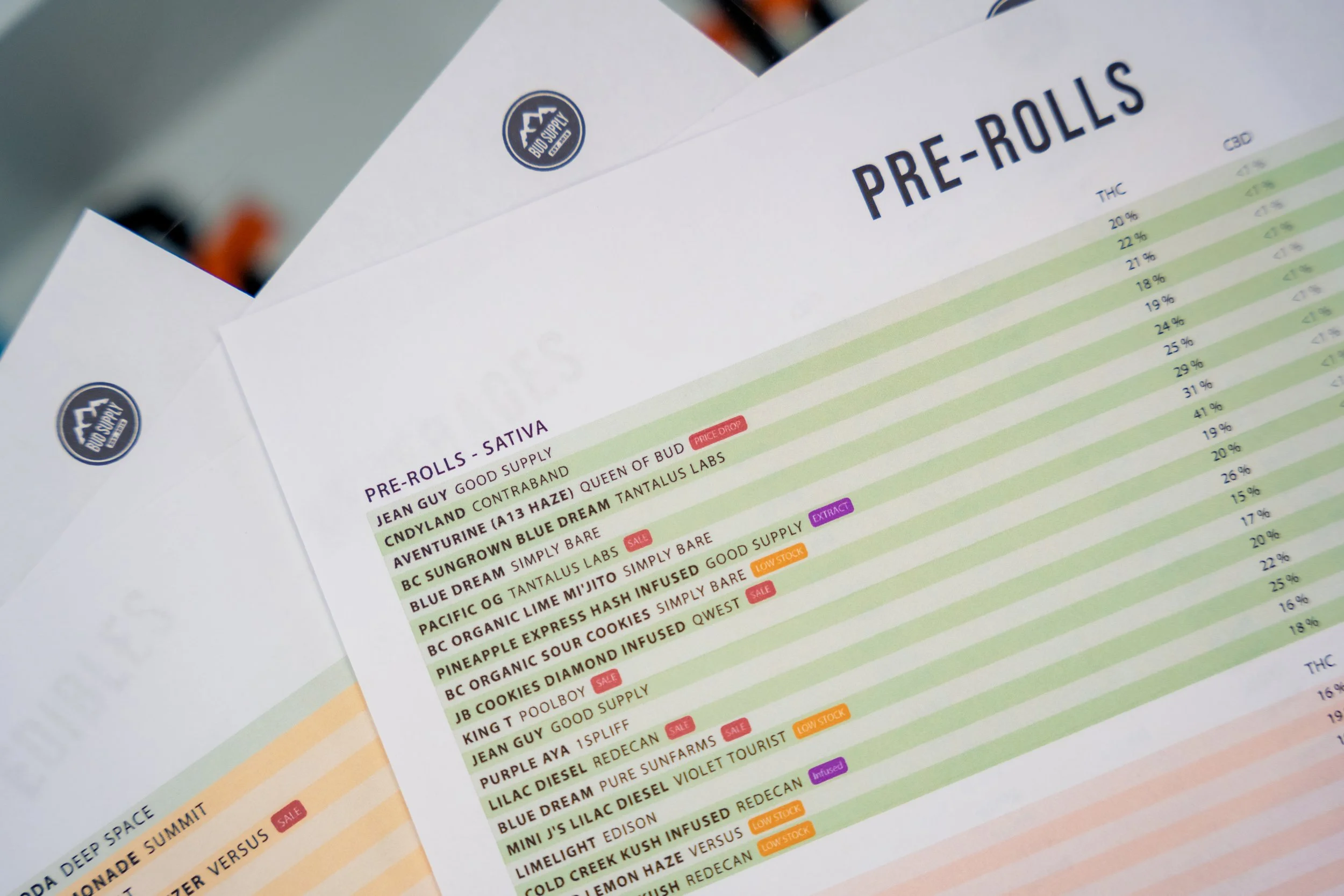
Imagine you're embarking on an adventure. You wouldn't want to be lost in the vast ocean of options, would you? That's where titles come to the rescue! Whether you're hunting for Flower, Pre Rolls, or Edibles, these bold headers act as navigational beacons, guiding customers to their desired destination. It's like having a trusty compass in hand, but with a delightful twist of cannabis excitement.
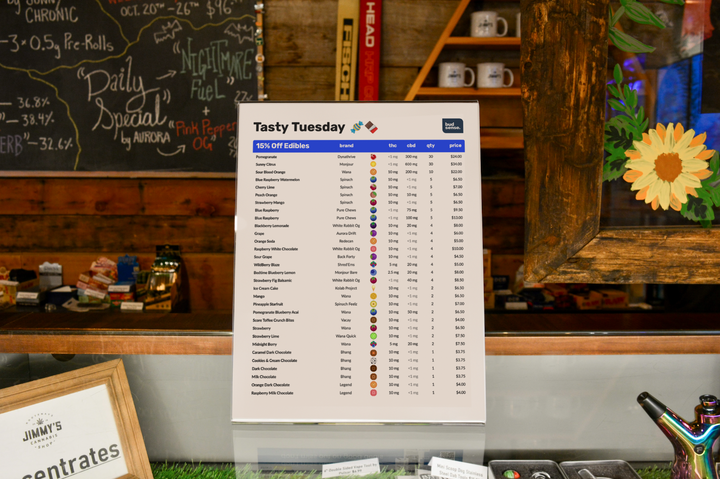
2) Brand Recognition: A Dash of Familiarity
Brand recognition brings warmth and familiarity to the cannabis shopping experience. Incorporating your logo or brand colors into the menu design reminds customers of the store they're visiting. It's like having a reassuring friend by your side during your journey through the menu. A little touch of brand love can go a long way in creating a memorable connection.
3) Badges and Labels: Sparkling Highlights

Who doesn't love a little bling? Badges and Labels play the role of sparkling highlights in the dazzling world of BudSense Cannabis menus. These little visual cues draw attention to particular items, acting like spotlight moments on a grand stage. Badges are like tiny icons that scream flavor profiles or effects of products, while Labels are your helpful assistants, whispering sweet product details such as “Infused”, “New”, “Staff Fav” into the ears of intrigued customers.
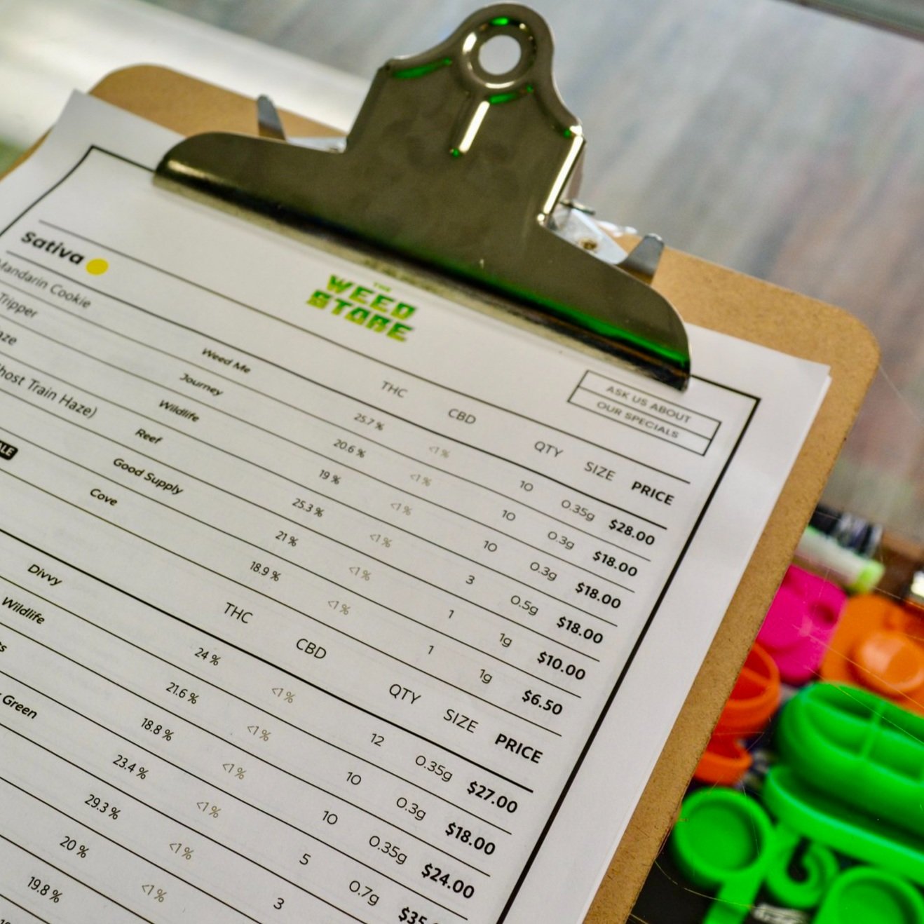
4) Legible Font Size: Easily Readable
Picture this: you've discovered a trove of enticing cannabis options, but the font size is like trying to decipher ancient hieroglyphs. Don't let your customers experience this visual puzzle! A legible font size is like a friendly handshake, ensuring that customers can easily read product names and details without squinting. It's all about making the journey through the menu smooth and enjoyable.
5) Simple Product Names: Elegant Simplicity

Say goodbye to unnecessary fluff and welcome elegant simplicity! There is room for all the details on your print menu, so keep the names to just that - the product names! Clean, straightforward names shine brighter than a supernova in the cannabis universe. Clarity is the name of the game here – strip away any excessive details that could hinder your customers' reading experience. Let those product names shine like stars, making it effortless for customers to choose their favorites.
6) Contrast: Eye-Catching Brilliance

Remember those magic eye puzzles that required endless squinting to reveal their hidden images? Let's not recreate that experience on your cannabis print menu. Adequate contrast between menu items and the background is the key to eye-catching brilliance. High contrast makes the text pop, ensuring customers don't have to summon their inner detective just to read the menu. Keep those eyes relaxed and engaged!
7) Consistent Spacing: The Harmony of Organization
Ever walked into a room where everything was perfectly aligned, and you felt an instant sense of calm? Consistent spacing on a cannabis print menu offers that same feeling of harmony and organization. It's like the beats in your favorite song – when items are evenly spaced, the browsing experience becomes a smooth and rhythmic dance, effortlessly guiding customers through their options.
8) Clear Cannabinoids: Simplify Potency
Let's face it – when it comes to cannabis, cannabinoids are the true rock stars. Arrange these potent performers in a clear row that allows customers to quickly compare products. It's like putting together a music playlist – you want the hits to be easily distinguishable and recognizable. By clearly displaying potency levels, you're empowering customers to make informed decisions and select the strains that resonate with them.
Cannabis Journey: One Print at a Time!
So, there you have it – the entertaining journey through the anatomy of a great cannabis print menu with BudSense! From large section titles that act as navigational beacons to clear cannabinoid rows that demystify potency, every element plays a role in creating a memorable and enjoyable shopping experience. So here's to crafting menus that are not mere lists, but gateways to a world of discovery and delight. Cheers to the art of cannabis menu creation with the brilliance of BudSense!

PS - Did you know with BudSense your print menus are automatically emailed to you daily?! All you have to do is hit print!
How do I learn more about BudSense?
Great Question! Book a demo today to learn more about how BudSense can enhance your cannabis dispensary!
Learn more about BudSense